Adam Rechenberg’s New Testament
Ἡ τοῦ Ἀδάμ Ῥέχενβεργ Καινὴ Διαθήκη
Adam Rechenberg’s New Testament discussed in detail and with lots of illustrations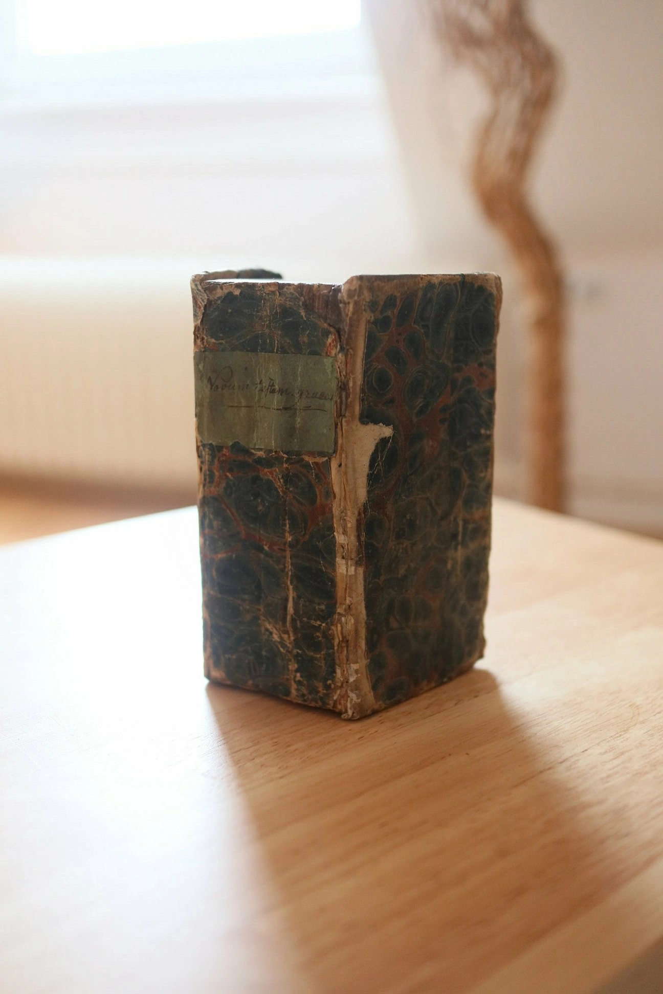
In the following article, I will be examining the oldest book I currently — as of November 2021 — have in my collection, namely Adam Rechenberg’s edition of the Greek New Testament. I have extensively documented various features of this book — and, most importantly, of this particular edition that I own — and will showcase those in this article, alongside some explanations and observations.
In the following section, I will be briefly talking about the publisher of the book and I will be mentioning what other books he has written or published, where he studied, where he lived and more.
Before I begin my examination of various points of interest in the book itself, I would like to begin highlighting some information about the author — or, rather, the publisher of this particular volume of the New Testament, Adam Rechenberg. I have misspelt his name frequently over the course of writing this website, as it is oddly reminiscent of Sherlock Holmes’ The Reichenbach Fall; my brain appears to have the desire to write Adam’s name not as Rechenberg, but rather as Rechenbach. My frequent consultation of the stories of Sherlock Holmes might have caused this issue.
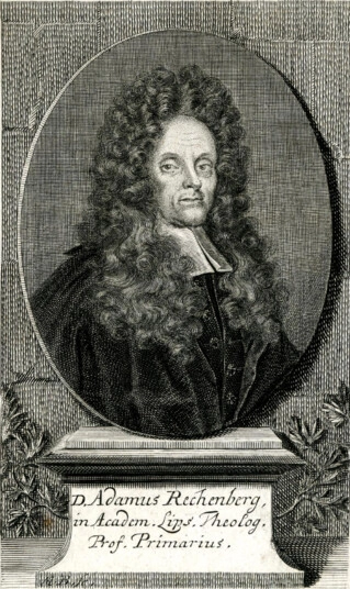
It was, unfortunately, rather difficult for me to find in-depth information regarding him, and the only two sources I found were a German Wikipedia article and a short biography on deutsche-biografie.de. The book itself does contain a number of prefaces written in Latin which might contain further information about the author and the reasons for his publishing this edition of the New Testament; as I do not, however, speak any (or, more accurately, only very little) Latin, finding out what these pages say will be a difficult affair. Nevertheless, over the course of this article, I will be providing you with images and a machine-translated version of some of the Latin in this book, hoping that such a — most likely rather sloppily translated — version might prove helpful and interesting to some. Should you, however, speak Latin fluently — or have sufficient enough knowledge of it to be of help —, feel free to write me an email.
Adam Rechenberg was born on September 7th, 1642 near the town of Augustusburg in the German state of Saxony; he died on October the 22nd, 1721 in the city of Leipzig (also in Saxony). His father was a squire named Clemens Rechenberg, and his mother was Christina Beyer, about whom I was unable to find any further information. After finishing his secondary education at a school in Freiberg, he began studying philology, history, philosophy and theology at the University of LeipzigNote [1]. He eventually became a professor of Greek and Latin in 1677 and was given the right to hold lectures on theology the year thereafter. By 1699, he had become a professor of theology and received his doctorate in theology the same year under Gottfried Olearius.
He wrote and published a rather large number of books, the majority of which were, however, rather small in their scope. Listing all of his works here would, I believe, not be of any use, so I hope it is sufficient to say that over eighty titles were written by him. He published fewer books than he wrote himself, including a copy of the writings of the Early Church Fathers and the book we shall be discussing in this article — The Greek New Testament.
Now that we have briefly examined the author himself, I believe we may commence our examination of this particular book of his. This section includes a physical description of the book, countless photographs thereof and some additional intriguing aspects I found prudent to mention. I shall be examining each prominent part of the book in detail and provide further insights.
Please also note that images in this section will be presented in a small gallery-like format; by clicking them, you can enlarge them and inspect them more closely.
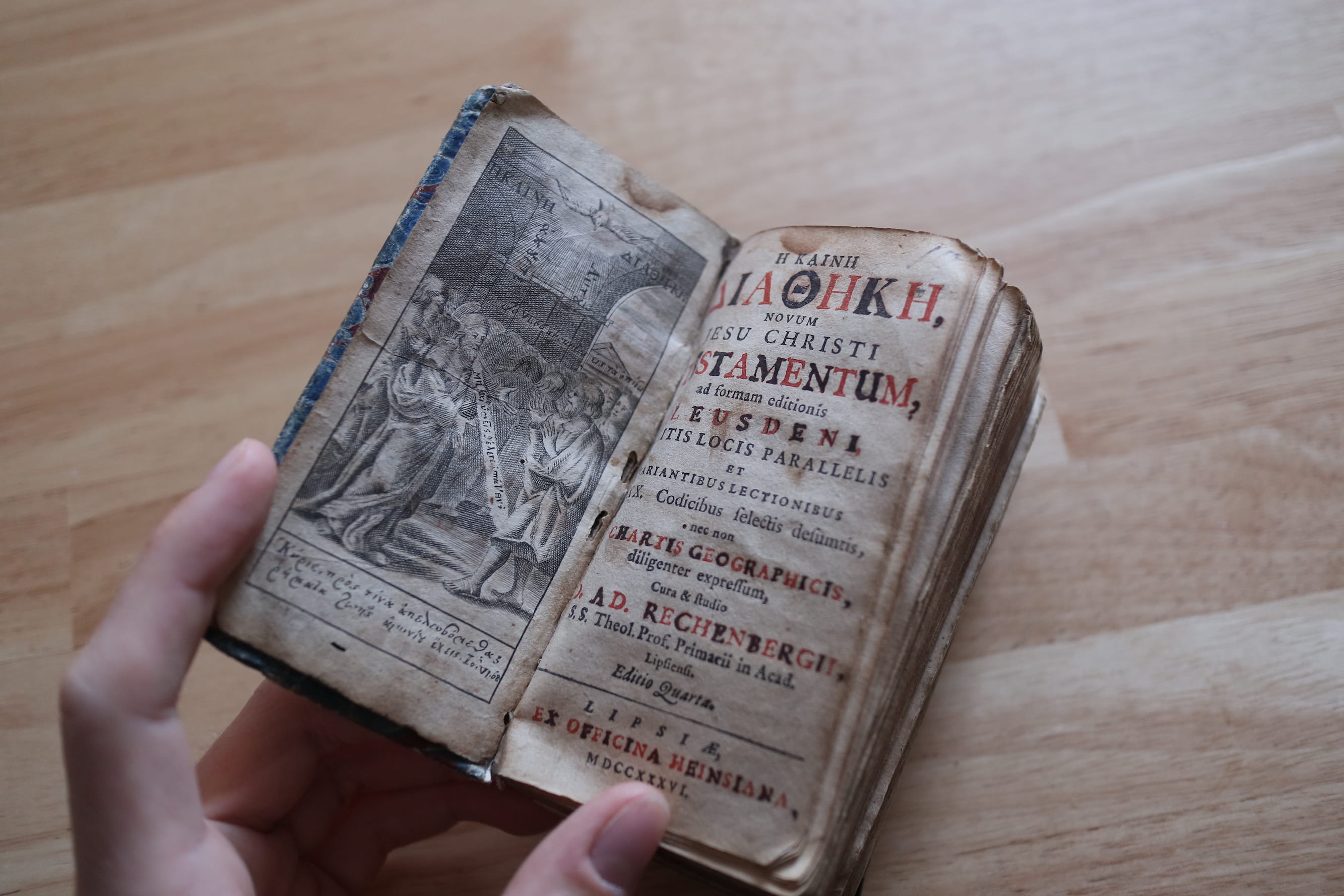
As the title page is generally that which the reader of a book sees first, we shall begin our examination of the book here. And, indeed, upon opening it, one immediately notices a rather nicely designed title with every other letter being coloured red, producing an interesting colour-alternating pattern. What I found rather interesting upon a somewhat closer inspection of the aforementioned coloured text, is that the black letters were not originally black; instead, it appears as if the text had originally been red — just as all the other letters — but was subsequently coloured black, presumably by hand after the printing of the book had finished. Why exactly it has been done this way is, unfortunately, beyond me, though I am guessing that it was impossible — or, at the very least, impractical — for them to print an alternating colour pattern such as this one using the printing technology available at the time.
Speaking of the title, it is actually bilingual (Latin and Greek) and is as follows: —
Η ΚΑΙΝΗ ΔΙΑΘΗΚΗ, (The New Testament)
NOVUM (New)
JESU CHRISTI (Of Jesus Christ)
TESTAMENTUM (Testament)
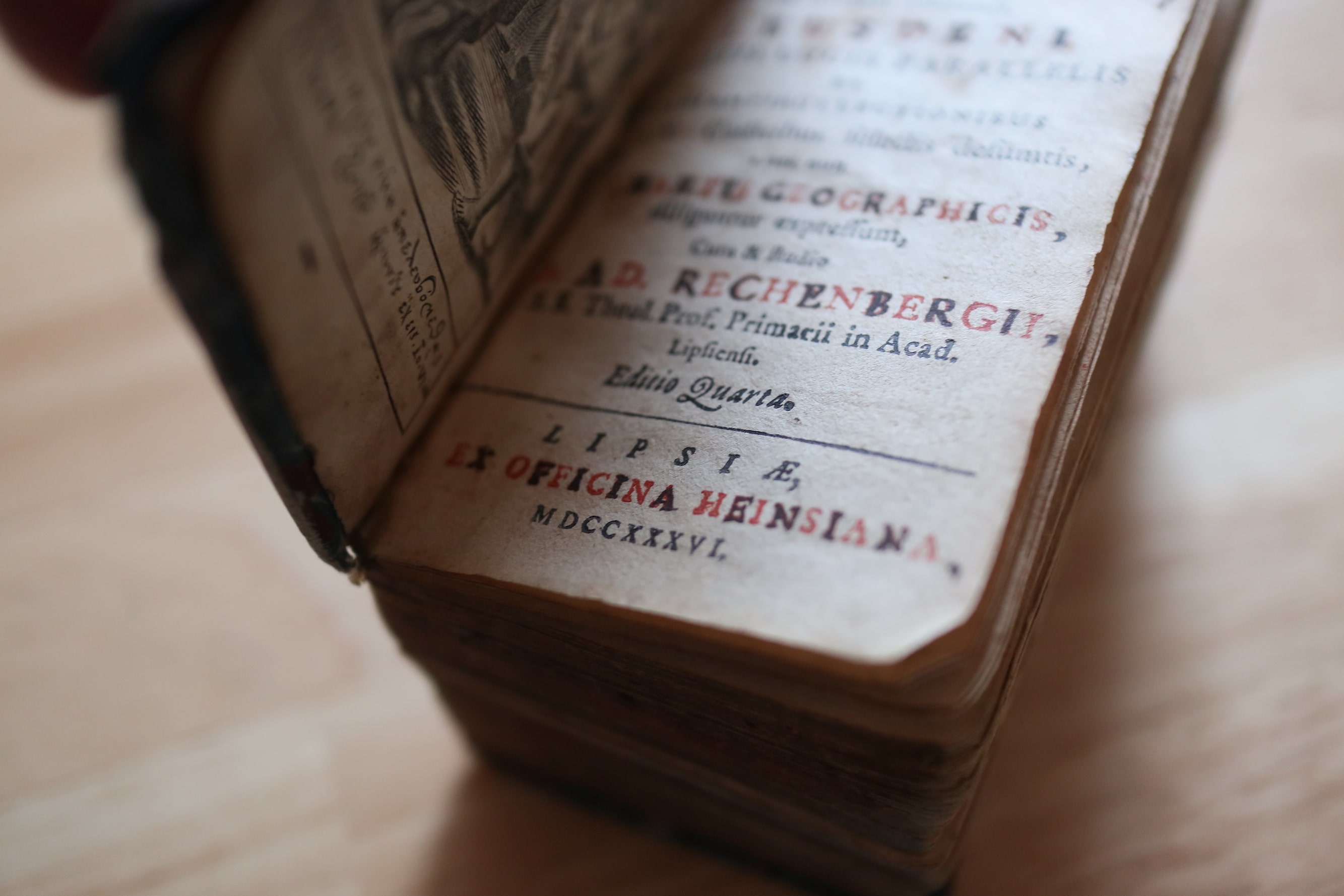
The remaining information present on the title page concerns things such as the textual basis (ad formam editionis Leusdeni
Note [2]), information on the author / publisher of the book and also the edition (which, in this case, is the fourth one).
Also of interest is the expression nec non chartis geographicis
which translates to as well as a map
; and, indeed, this volume actually does include a map of the Holy Land glued onto one of the later pages of the preface — we shall be examining it more in-depth later on.
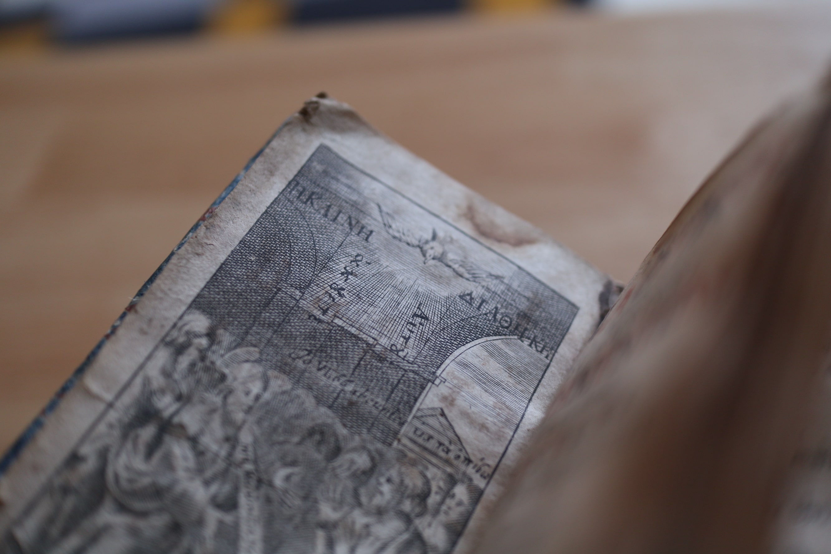
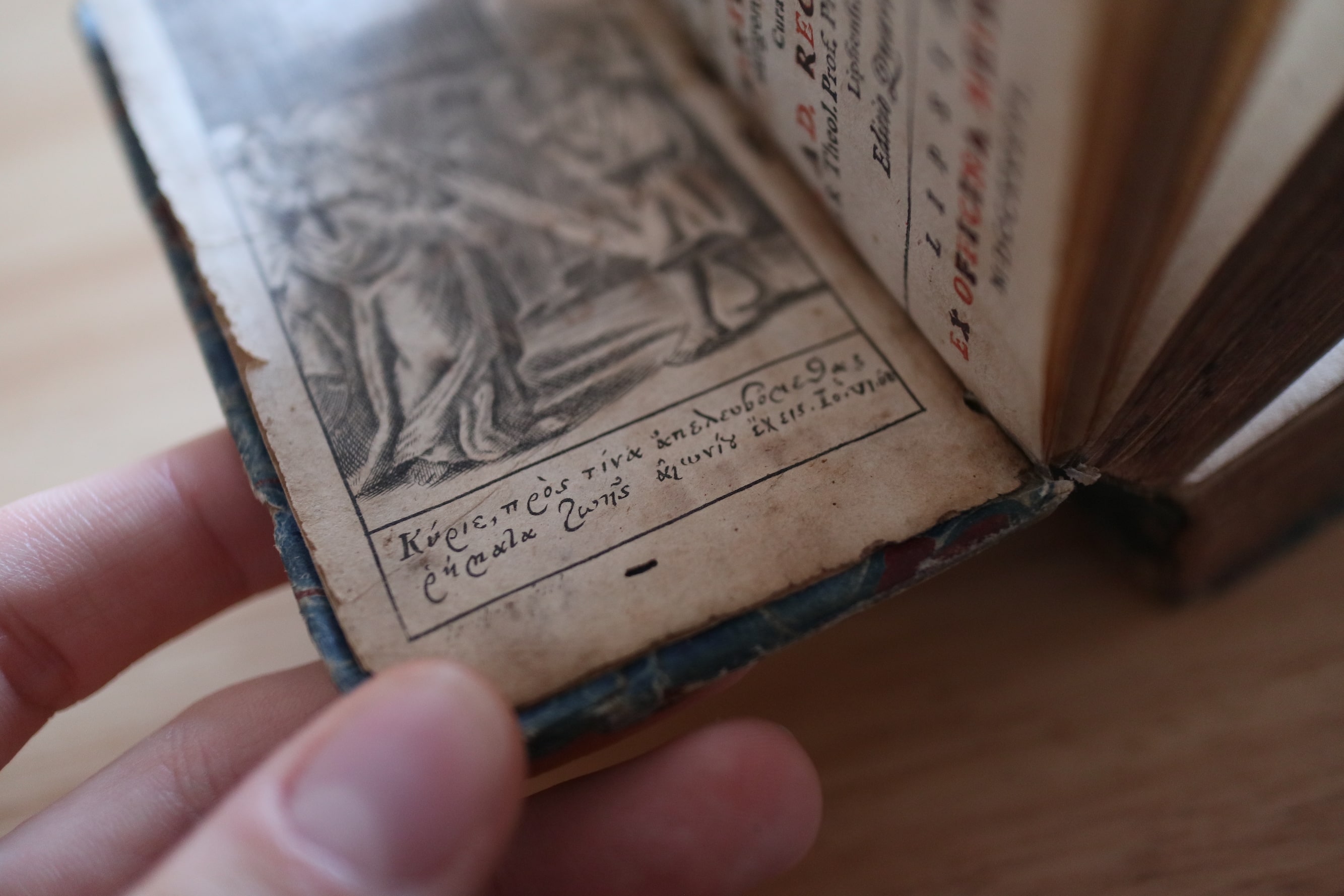
On the opposite side of the title page, a nice illustration — which appears to be a chalcography — can be seen with a small Bible quote (taken from the Gospel of John) underneath which reads the following: —
Greek: Κύριε πρὸς τίνα ἀπελευσόμεθα ῥήματα ζωῆς αἰωνίου ἔχεις. Io. VI. 68.
Translit.: Kyrie pros tina apeleusometha rhēmata zōēs aiōniou echeis
Translat.: O Lord, whom shall we go to? (For) you have the words of eternal life.
The illustration itself is most likely a depiction of a scene from John’s Gospel as well, since there is a figure standing in the middle of the illustration, which has a halo floating above his head, and from whom there is pertruding a white bar (akin to a speech bubble). In the background, one can spot the backs of other people (who are most likely leaving the scene) and the figure appears to be addressing one person in particular and saying the following: —
Greek: Μὴ καὶ ὑμεῖς θέλετε ὑπάγειν;
Translit.: Mē kai hymeis thelete hypagein?
Translat.: Surely you (guys) do not want to leave as well?
This is a direct quote from John 6:67, wherein Jesus is addressing the twelve apostles after having been left alone by (a large number of) his desciples and hopes that they will not leave as well. Considering the remainder of the illustration (as mentioned above), I would argue that the likelihood of this being a depiction of that particular Bible passage is rather high. The illustration also has a — only rather faintly visible — title at the top which simply reads ΚΑΙΝΗ ΔΙΑΘΗΚΗ with a dove — or similar bird — in-between the two words.
All in all, I find the illustration rather nice and the attention to detail — regarding the short Bible quotes upon which the illustration is based — remarkable.
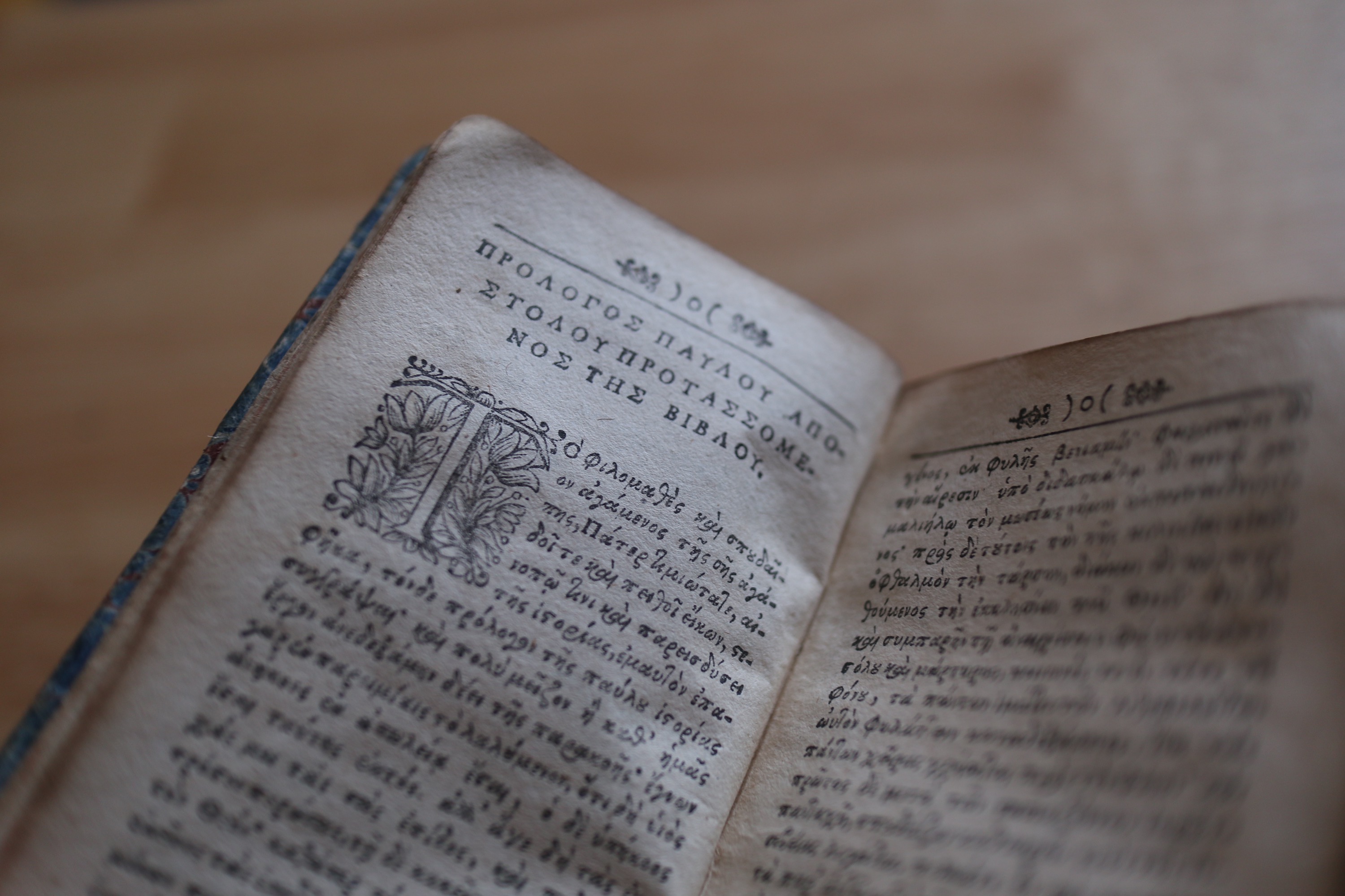
What follows is the preface written in Latin and a prologue written in Greek, with the latter being titled as follows: —
Greek: ΠΡΟΛΟΓΟΣ ΠΑΥΛΟΥ ΑΠΟΣΤΟΛΟΥ ΠΡΟΤΑΣΣΟΜΕΝΟΣ ΤΗΣ ΒΙΒΛΟΥ
Translit.: PROLOGOS PAULOU APOSTOLOU PROTASSOMENOS TĒS BIBLOU
Translat.: Prologue of Paul the Apostle, prefixed to the Bible / book
As I am unfortunately unfamiliar with that prologue and the font is still somewhat difficult for me to decipher, I cannot really read what is written here. I am also somewhat unsure regarding my translation, as I have never come across the participle προτασσόμενος; as προτάσσω, however, means to prefix
or to place in front of
, I am fairly certain its mediopassive participle has a similar meaning and that my translation of prefixed
is adequate.
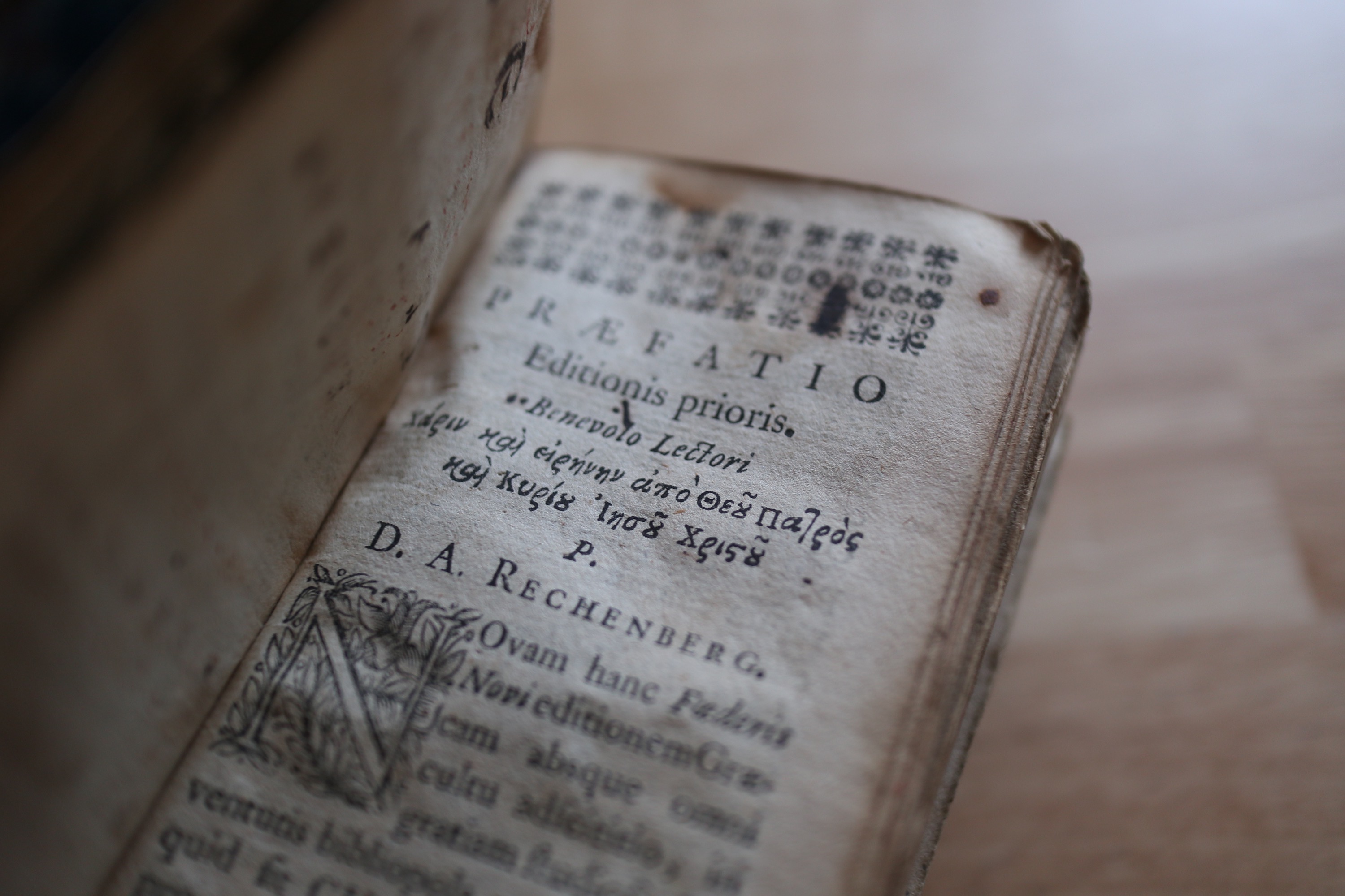
The Latin preface (the Præfatio editionis prioris
, Preface of the first edition) contains a short Greek quote underneath its title which is as follows: —
Greek: Χάριν καὶ εἰρήνην ἀπὸ Θεοῦ Πατρὸς καὶ Κυρίου Ἰησοῦ Χριστοῦ
Translit.: Charin kai eirēnēn apo Theou Patros kai Kyriou Iēsou Christou
Translat.: Grace and peace from God (our) Father and the Lord Jesus Christ.
This appears to be a strangely shortened version of Galatians 1:3; and additionally, both the words for grace
and peace
are declined in the accusative case in this particular shortened version — and I see absolutely no reason for their being in anything but the nominative. It would make sense if, perhaps, one placed a verb such as I give
(δίδωμι) in front of the sentence — but this has not been done here. Though one may argue that it was simply left out.
I would very much like to dwell on the topic of discussing the preface and prologue, but as the preface is written in Latin and the prologue, unfortunately, not entirely understandable to me, I have decided to move on to something that is, though but marginally, related to the prologue — the aforementioned map.
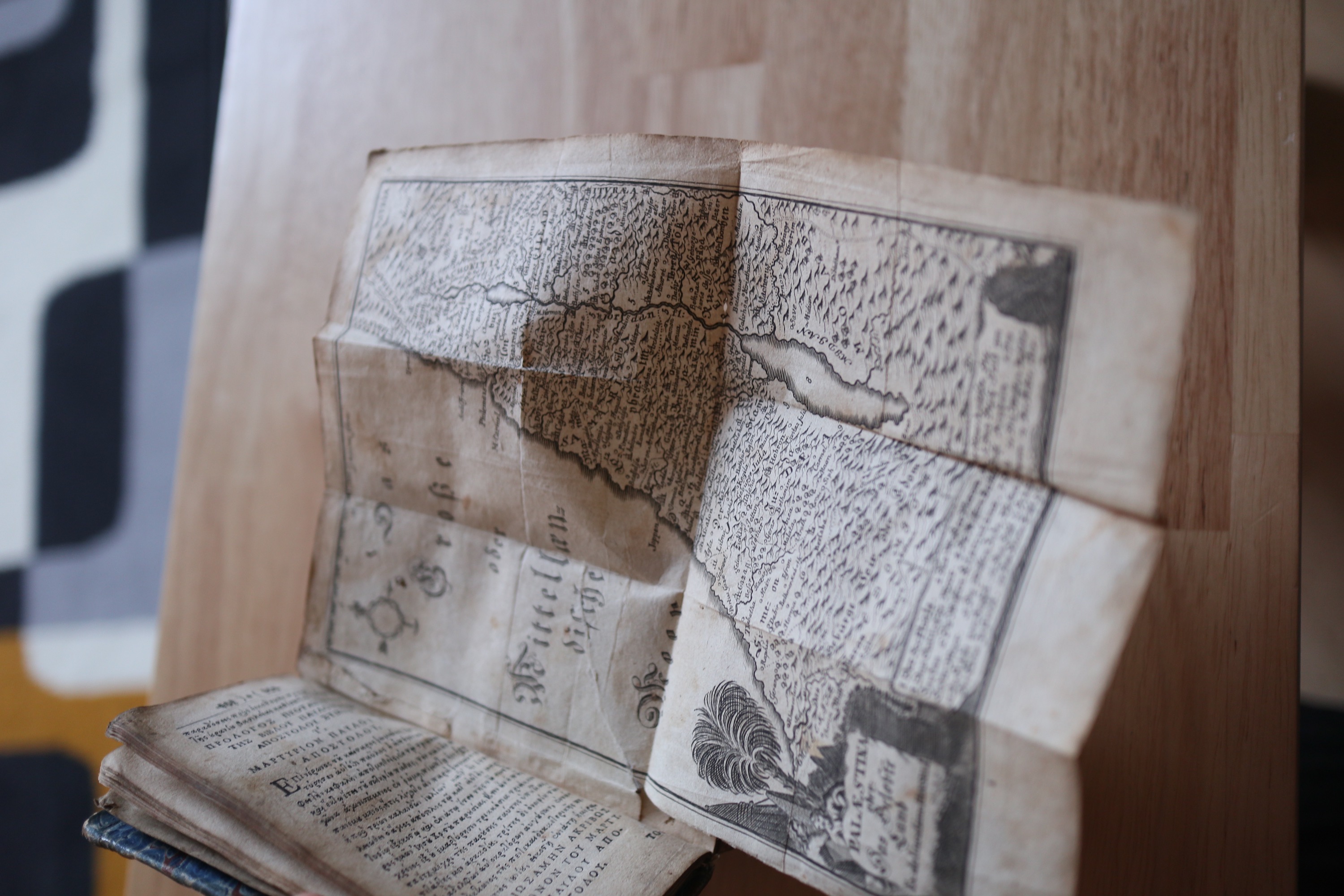
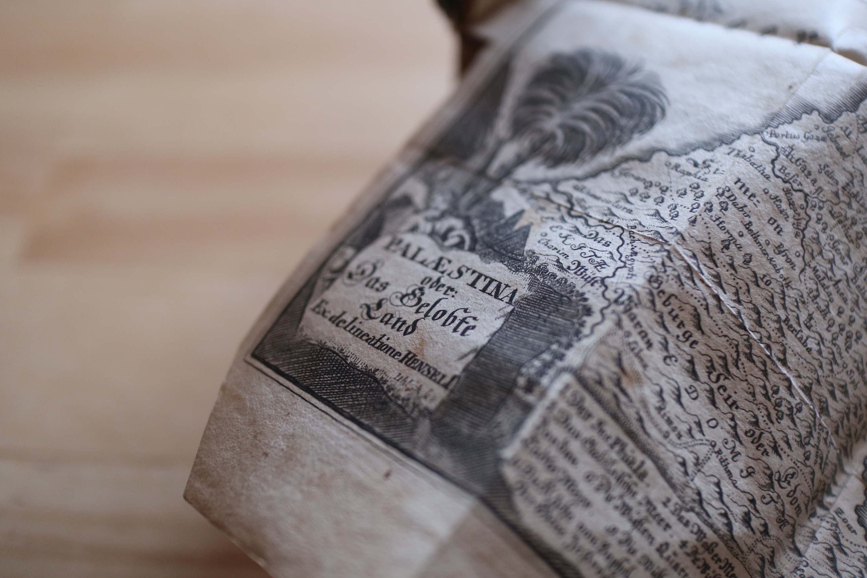
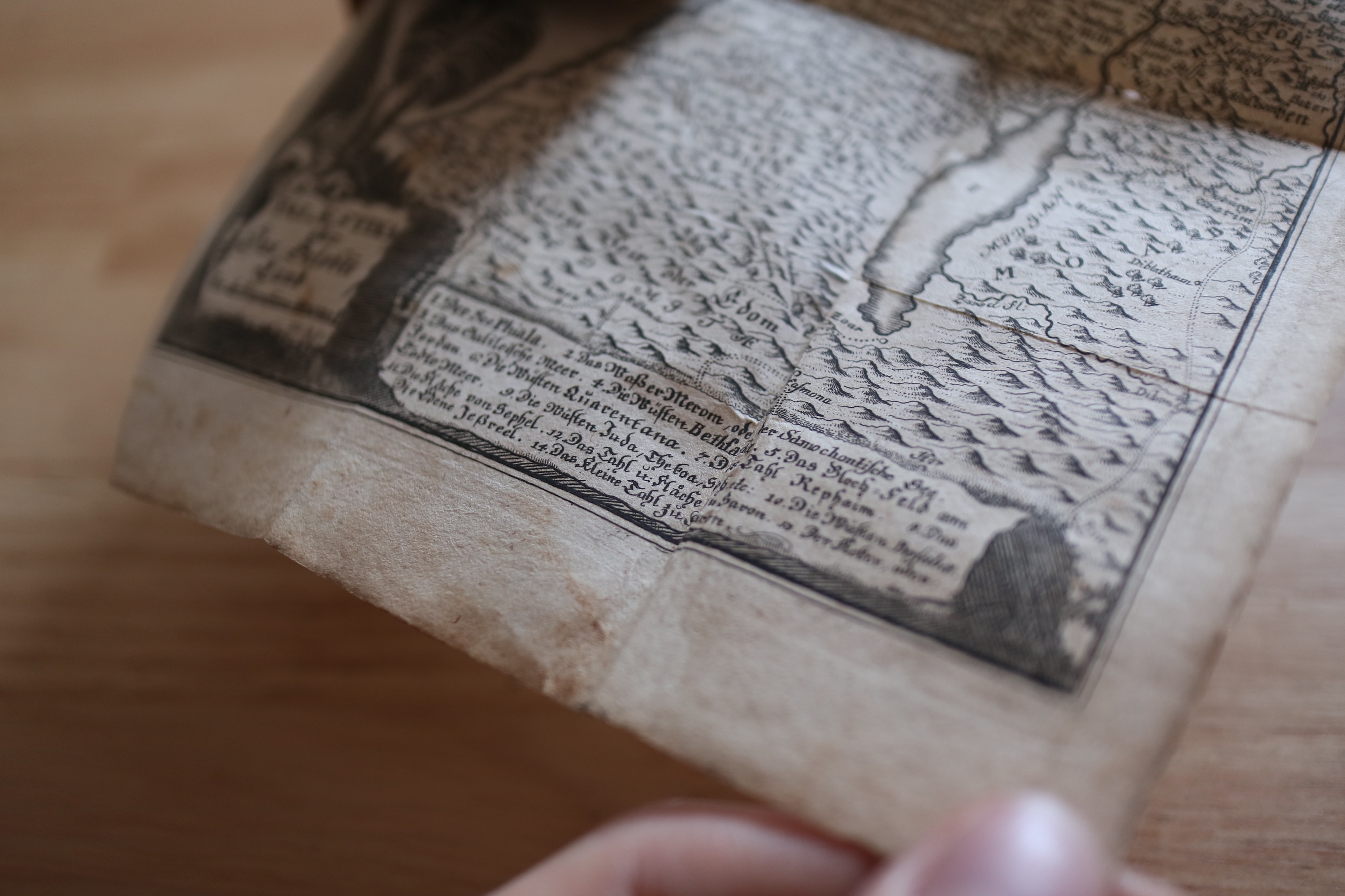
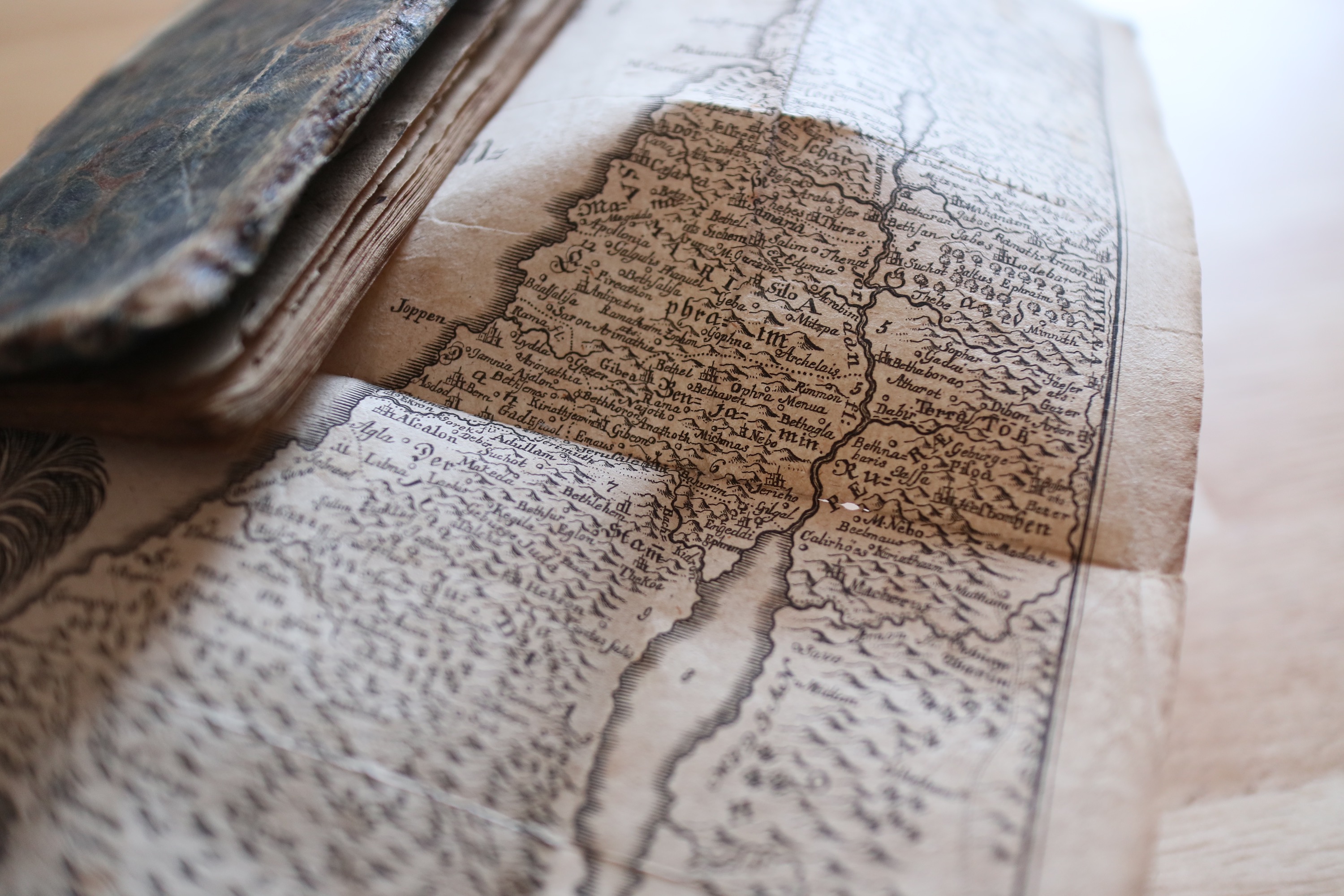
One thing that immediately struck me and that had me fascinated from the beginning was a fold-out map hidden within one of Paul’s prologues. I was shocked at how well-preserved it was, considering how often it must have been folded and unfolded over the years; though I do confess I was particularly careful whilst handling it, for it felt as if it would rip apart if I so much as looked at it from an angle it did not deem worthy enough.
The map is very detailled and contains the names of countless regions and cities all over what it calls Palæstina oder: Das Gelobte Land
(Palestine or: The Promised Land). The Mediterranean is also present and labelled as Das Große oder Mitellændische Meer
, though it would nowadays usually be referred to simply as Mittelmeer
.
Towns, mountains and various other things can be immediately identified by a small depiction of houses or a hill — and there are countless of these. Simply open the closeup image above and see for yourself.
Personally, I found it staggering that a fold-up map glued onto one of the pages of a 300 year-old book would be this detailled and well-preserved; and whilst there are, indeed, a handful of blemishes and holes, I would not have been able to guess its age correctly had I simply been shown the map without any context.
Furthermore, various numbers are placed all around certain locations on the map and the name of the place they are referring to can be found at the very bottom of the map; their names are, as is the rest of the map, written in German using a standard — for the time — blackletter typeface, most likely simply Fraktur (though I am, by no means, an expert on typefaces and their names).Note [3]
All in all, I must admit that I found the map one of the most interesting — if not the most interesting — parts of this book; its discovery was totally unexpected to me and I was most delighted to find this small piece of art work so well-preserved in this book.
I could probably continue adding remarks about this map and study it in details, but I fear it would simply make this already rather lengthy article even longer — why, even too long for what it is worth. Should I receive requests to cover this map in more detail, I shall; but for the time being, I will leave it at this.
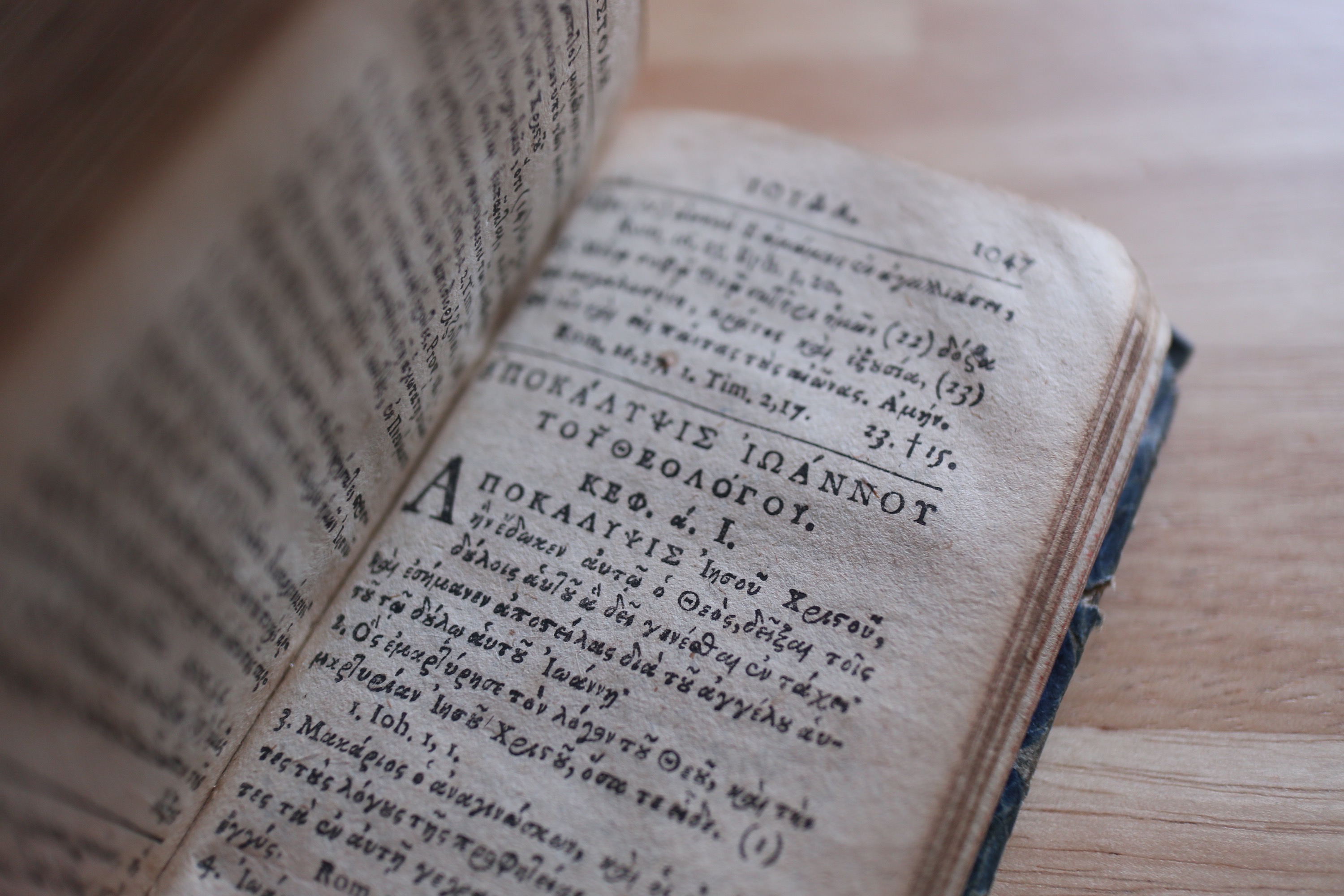
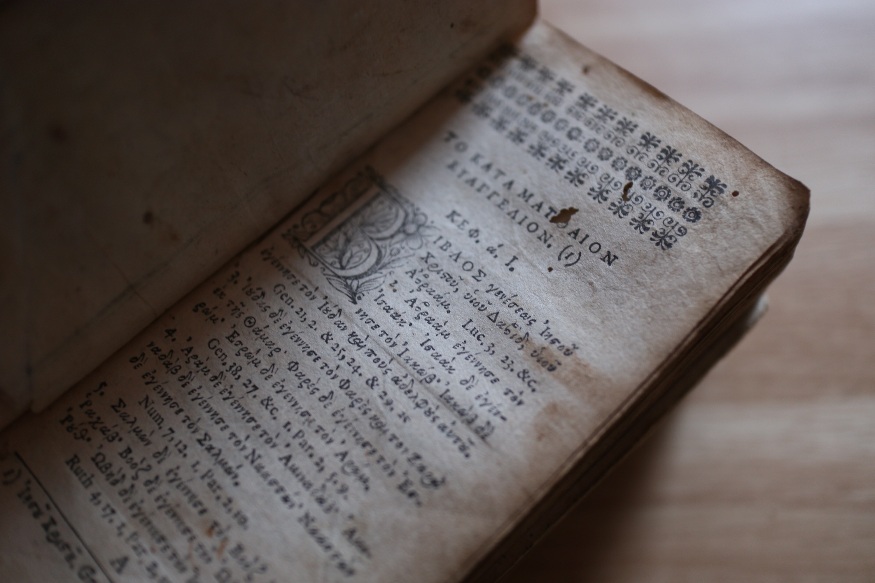
Why indeed, one may have already forgotten that the book we are currently discussing is a copy of the Greek New Testament; and as such, this is what makes up the bulk of the volume. Thus, we shall now briefly examine this particular edition of the New Testament, although I will not have much to remark about it — it is, quite simply put, an edition of the New Testament as most others and what makes it remarkable is what I have already discussed and what I shall — in later chapters — continue to discuss.
The text of the New Testament itself is pretty unremarkable as far as I was able to tell; sure, there are some differences between this edition and the 28th edition of the Novum Testamentum Graece (NA 28) or the UBS 5; but unless you are attempting to do a philological or theological study on these texts, the difference between the two is negligible.
The pages in general are in great condition, all things considered, but there are various holes or blotches that can be spotted on a handful of pages; though this is to be expected from a book of this age. The text, barring the unusual fontNote [4] I still have to get used to, is also very legible and everything can be read with ease.
But as this is, as I have previous mentioned, simply an edition of the New Testament, there is not much more to say; therefore, let us now proceed to a more interesting part of this book.

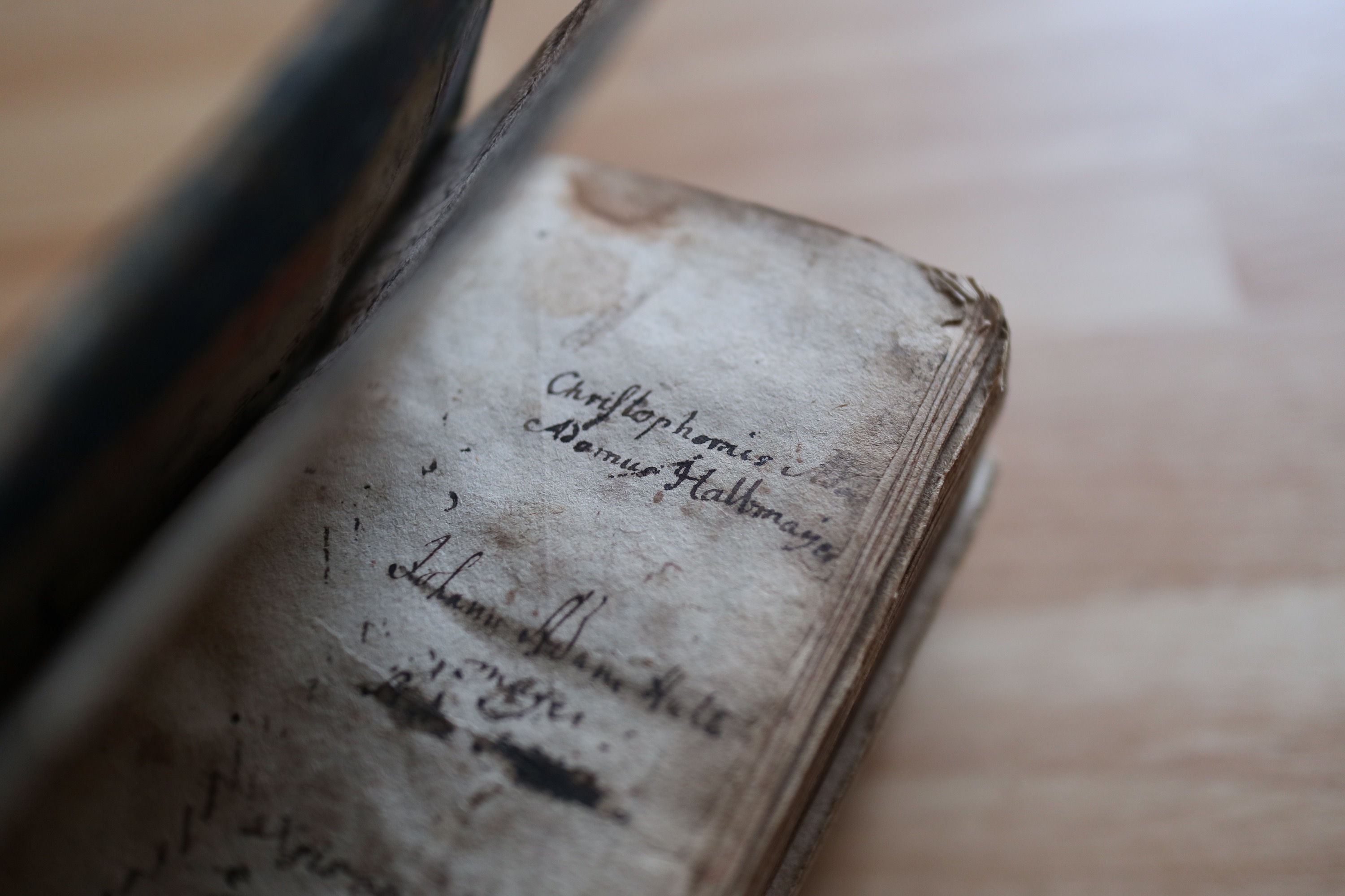
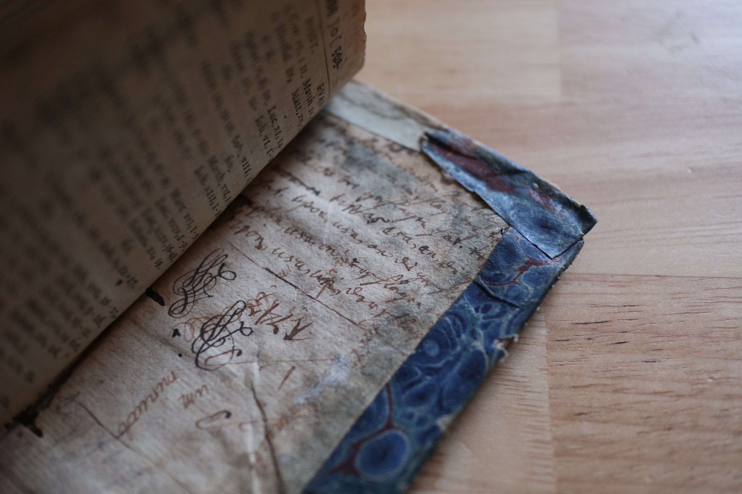
Another thing that I immediately noticed were a variety of strange and rather mysterious notes and squiggles in the front and back of the book. Unfortunately, I am unable to make up a large amount of what has been written down here, mostly due to the person‘s handwriting; I do, however, believe that the majority of notes are actually German.
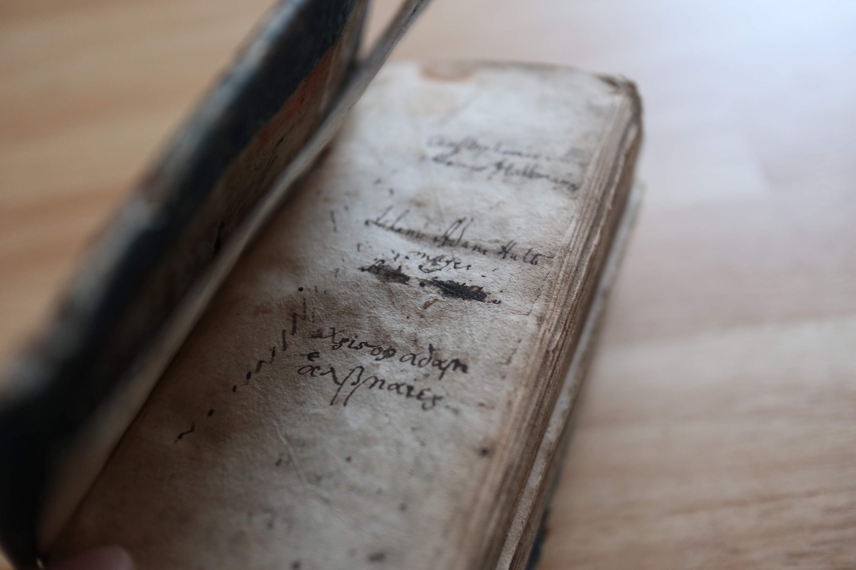
Front notes #2, for example, quite clearly shows the name of a man which I believe to be either Christophernis or Christophonis Adamus Halbmeyer which is most certainly a German — though perhaps Dutch as well — name. He even appears to have erased part of his name after realising it wouldn’t fit on the page entirely, as you can see a very faint black writing reading Ada
directly behind his first name. He must have erased it and continued to write his name on the line beneath.
Directly beneath this name one can find yet another name belonging to what appears to be the same family: Johanis Adam Halbmeyer. The handwriting is similar enough, but I do not know for certain if it was written by the same person or by someone else; I almost believe that the same person wrote both names, as the handwriting really is remarkably similar. Directly beneath Johanis‘ name, there appear two black blotches of ink on the paper which are trying to hide yet another name which, I believe, once again contains the name Adam
; it is, however, rather difficult to decipher.
The bottom of the page, which can be seen on Front notes #2, contains the name we also encountered at the top of the page but written in Greek this time: Χριστοφ αδαμ ἁλβμαιερ (sic). The a
in Adam
is curiously missing a breathing mark and the iotas all have dots on top of them as they would in the Latin script.
The page also contains various squiggles and zig-zaggy lines, presumably jotted down to test or start
a pen — it is the same thing that I tend to do as well, though I do not misuse my books for such a purpose.
The opposite page contains the names of various Greek letters written in a rather nice-looking handwriting and yet further squiggles and lines. I am not entirely certain why they would have been written down here and why only a small handful of them were written down as opposed to the entire lot; though who knows? This could have simply been a bored student squiggling around in his book.
The back contains what appear to be notes of some kind, although they are completely unintelligible to me and I could not even venture a guess regarding the language these notes were written in. Curiously, however, the notes appear to go underneath the blue cover, making me believe that the paper / cardboard these notes are written on was used for something different before it was placed in this book. And once again, this page also contains various squiggles.
All in all, I found this book extraordinarily interesting to study and examine; there are so many quirks and notes and interesting pieces of information that make it very intriguing — and the various and, in my opinion, often rather mysterious notes really add a certain personality to this book. It is always interesting to know to be the owner of an item that is one of its kind.
[1] Interestingly enough, the deutsche-biographie.de website actually mentions some of his teachers’ names, which I found rather intriguing. Amongst these are Rappolt, Thomasius and Frankenstein (yes, indeed) who were teachers of the philosophical subjects; and Scherzer, Kromayer and Geyer were teachers of theology. I was particularly surprised seeing the name of Frankenstein here. Back to text
[2] The word Leusdeni
that appears here is, in actuality, the genitive form of the name Leusden
, belonging to a very prominent Dutch theologian of the 17th century. His full name was Johannes Leusden and he wrote a substantial amount of books on the Bible and even published his own Biblia Hebraica. Back to text
[3] There are, despite what many may believe, a large number of different blackletter typesfaces and which one was used depends on the year a certain publication was released and — I am sure — the preference of the author; I am also sure that certain printing presses only had one set of letters, so those had to be used no matter what the author would have preferred. Fraktur is one of the most popular German blackletter fonts and I am thus quite certain it is what has been used here as well; though it could also be Schwabacher. Back to text
[4] Although this has but little to do with this particular book, I wanted to briefly mention a fanstastic little package for LaTeX titled philokalia. It provides a great and interesting font for Ancient Greek and also contains nice Greek drop capitals which I have used extensively in my books; I highly recommend you take a look at this.Back to text